Once in a while, we can all use a good reminder of how simple execution of a great idea can be more effective than all the bells and whistles you can shake a stick at….and, what’s with the stick shaking anyhow?
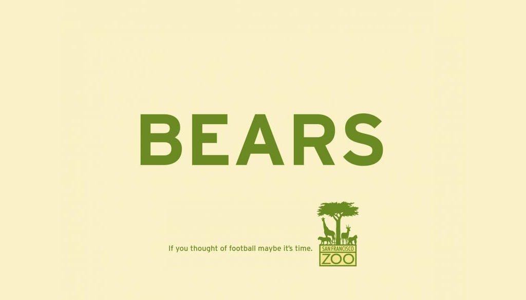
In this instance, a single word is emblazoned across the middle of an ad, coupled with the organization’s logo and a simple call to action that we immediately “get”, resulting in a head-nodding chuckle. That’s it. No fancy Photoshop tricks, no superhot, scantily-clad models, carefully-selected stock images or overdone design. Just the perfect marriage of relevant observation to effective implementation.
Oh, yeah, and it delivered a palpable result for the client organization, too…
See for yourself: San Francisco Zoo Print Campaign