WORK
Project Brief
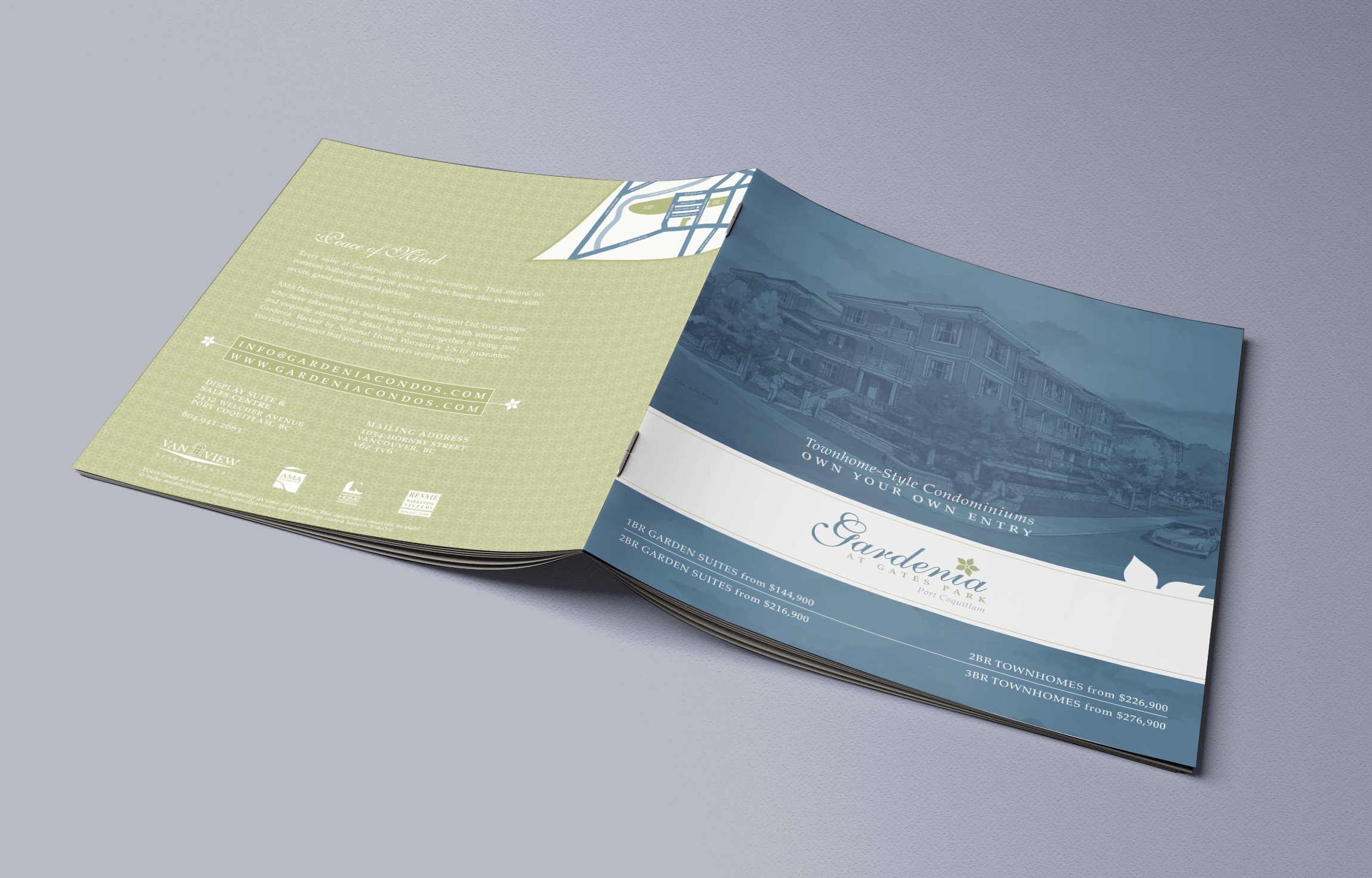
Gardenia is a townhome-style condominium development marketed by Rennie Marketing Systems – an industry leader in real estate marketing and a household name in Lower Mainland British Columbia.
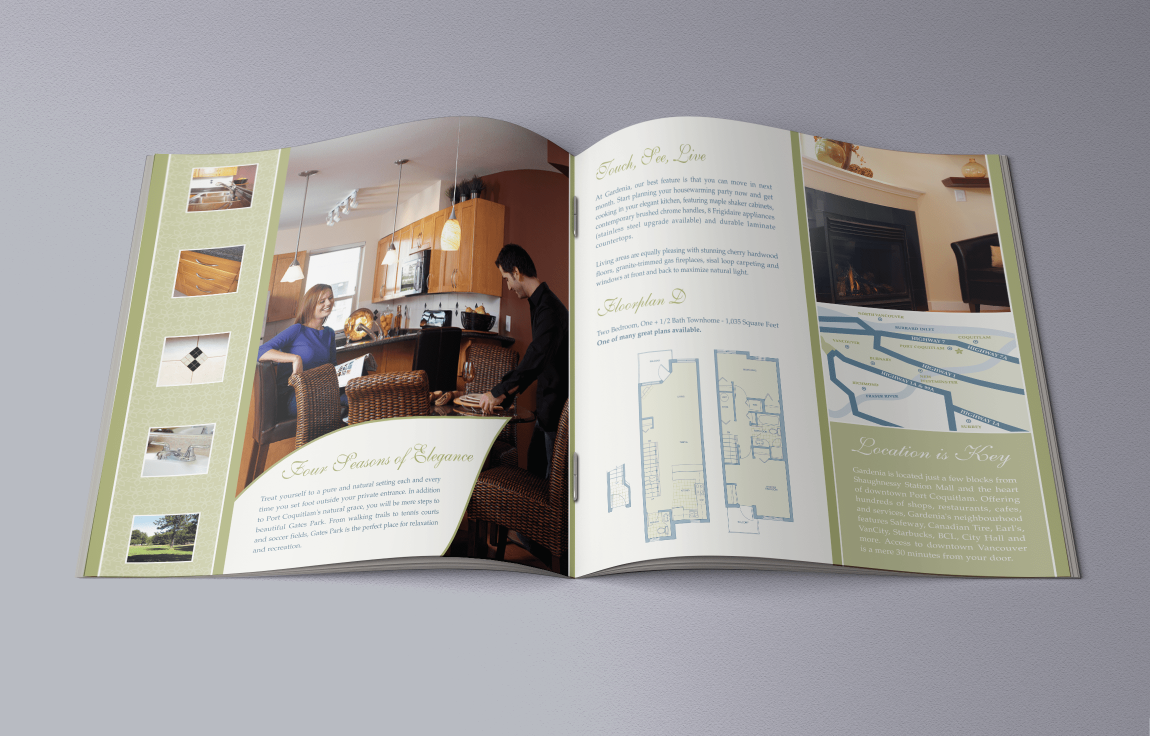
For the Gardenia project, Rennie wanted to portray the park-like setting of the lushly-landscaped project and the luxury of the spacious interiors.
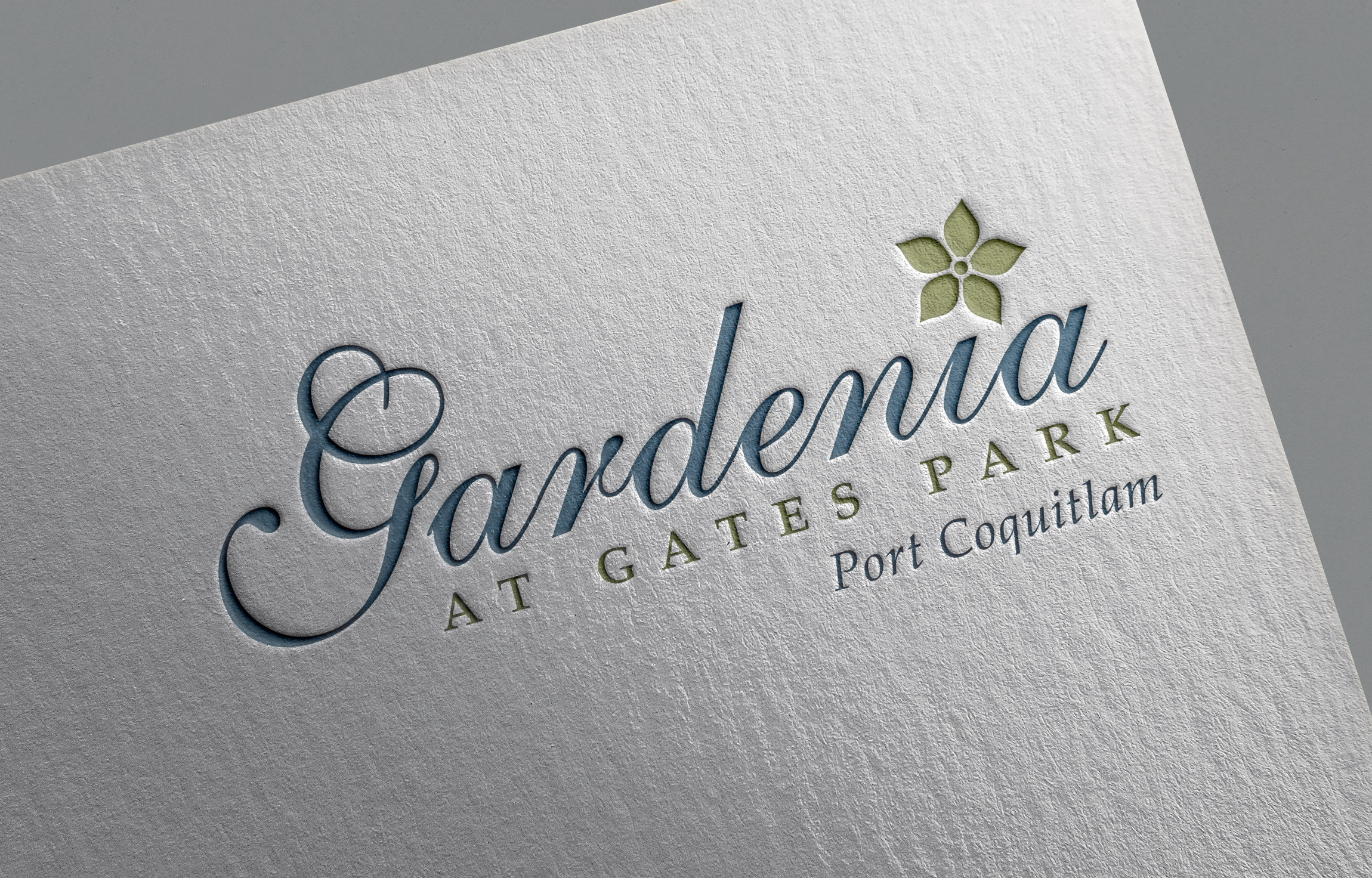
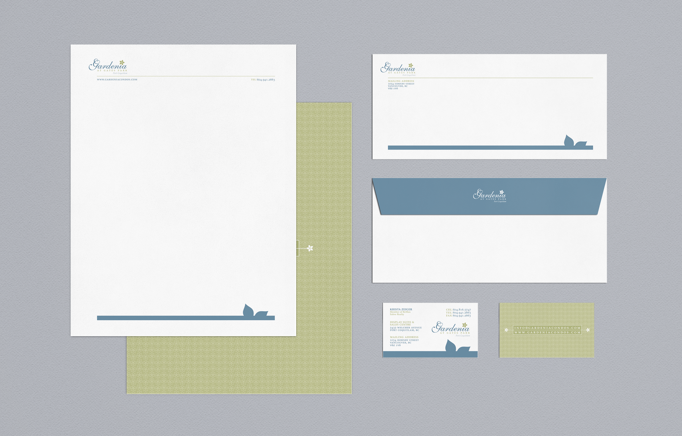
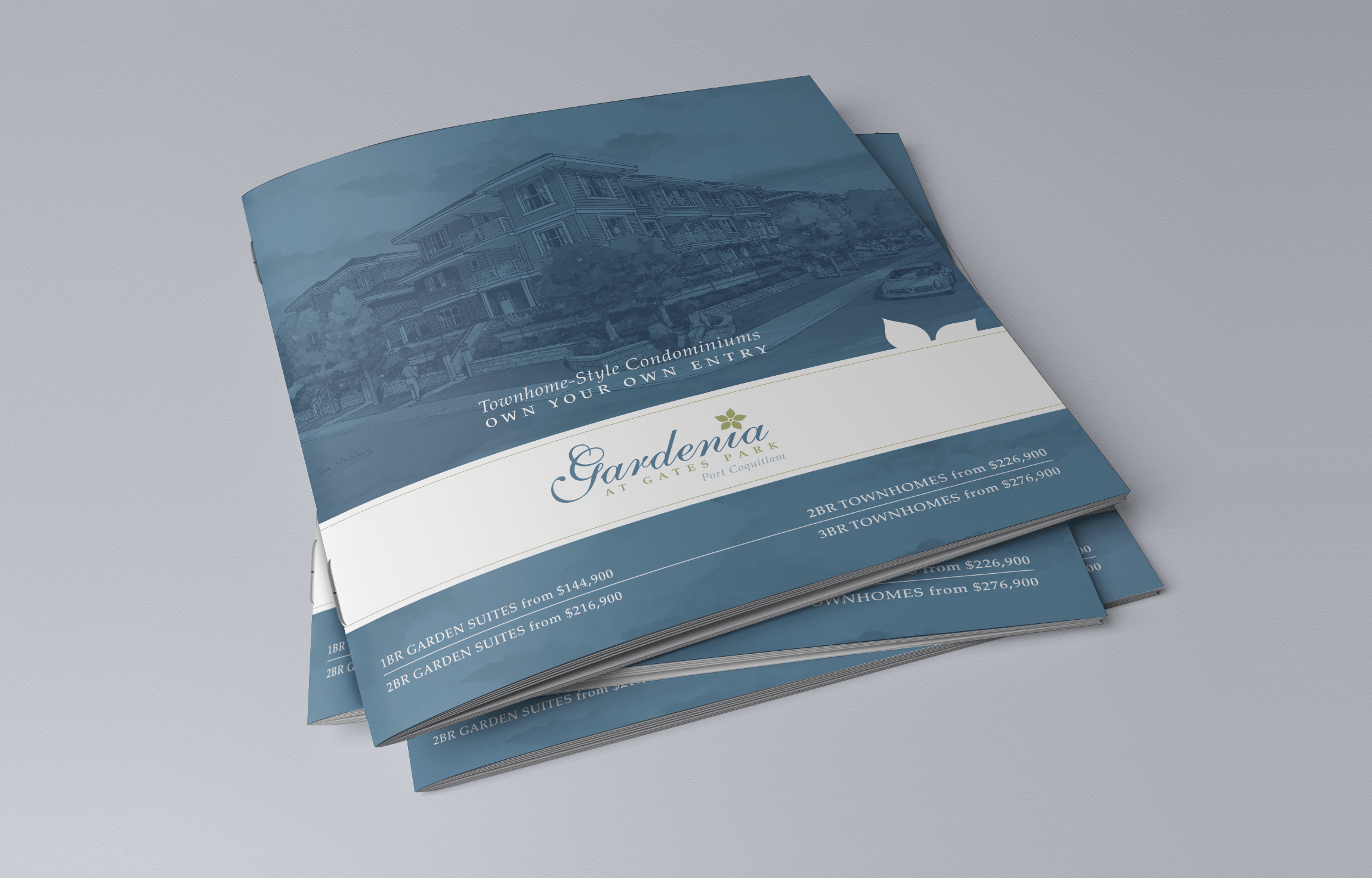
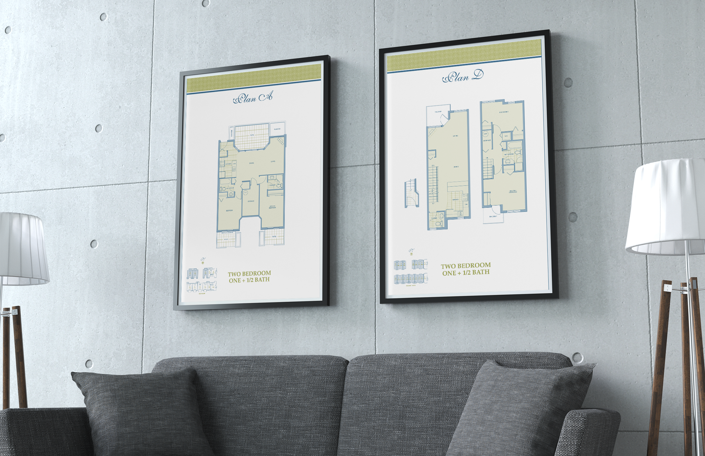
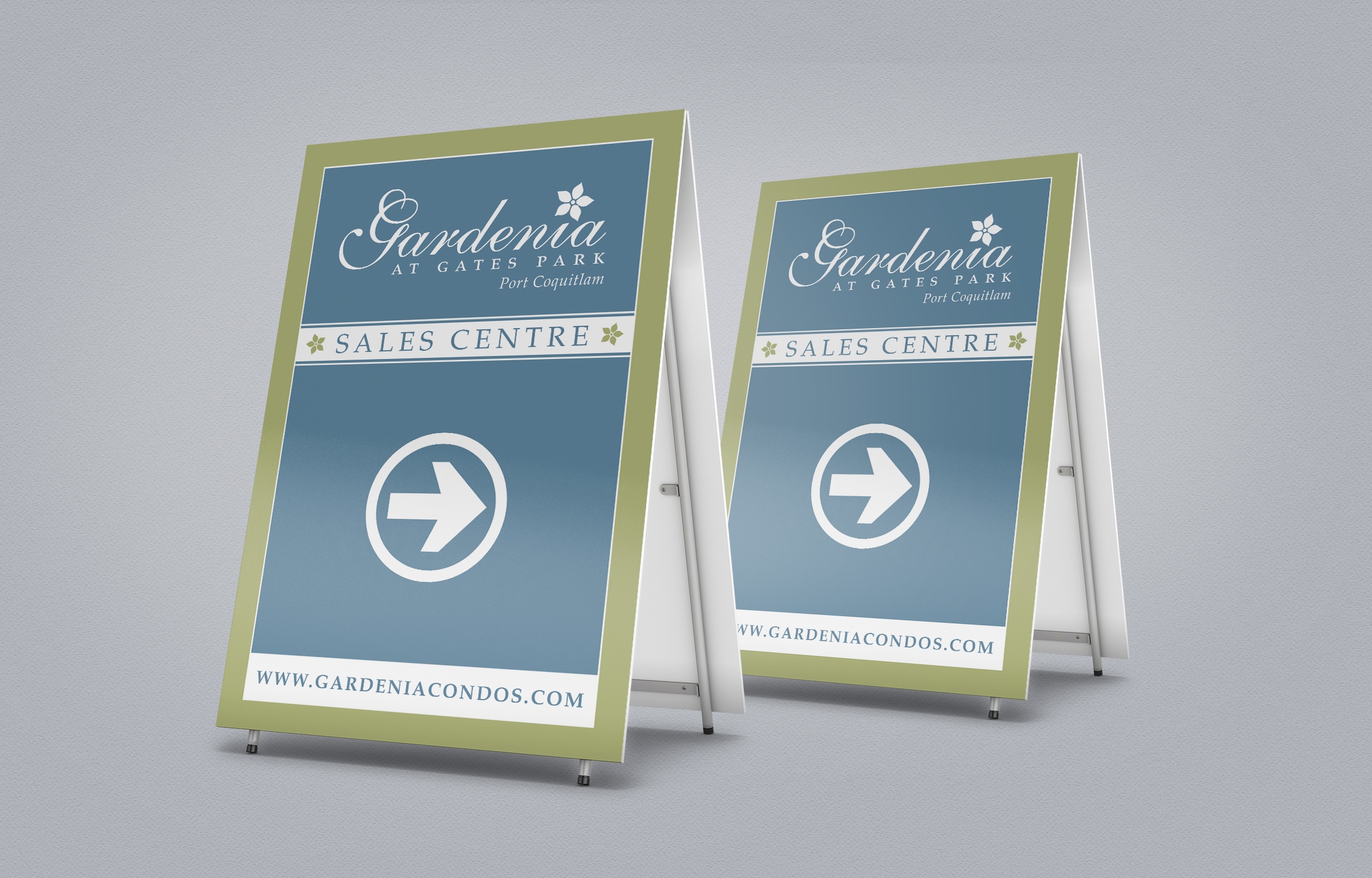
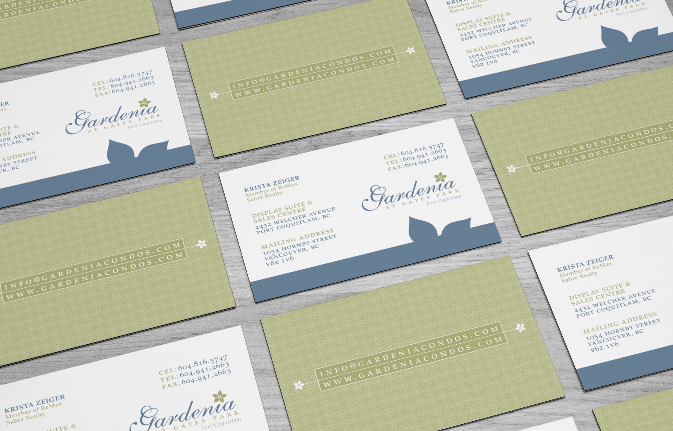
By using a sophisticated, but simple script typeface coupled with a gardenia flower bloom that serves as the dot for the letter “I” in the project’s name, we ensured that Gardenia’s identity communicated the garden-like aspect of the property which makes it unique. A classic serif font family was used for secondary typography to reinforce the luxurious feel of the project. The floral motif was used creatively throughout the project for patterns and shapes that provide a cohesive look and feel throughout the campaign.
Client Details
- Rennie Marketing Systems
- Real Estate Marketing
- Branding, Print, Real Estate
- Vancouver, BC
- www.rennie.com
