WORK
Project Brief
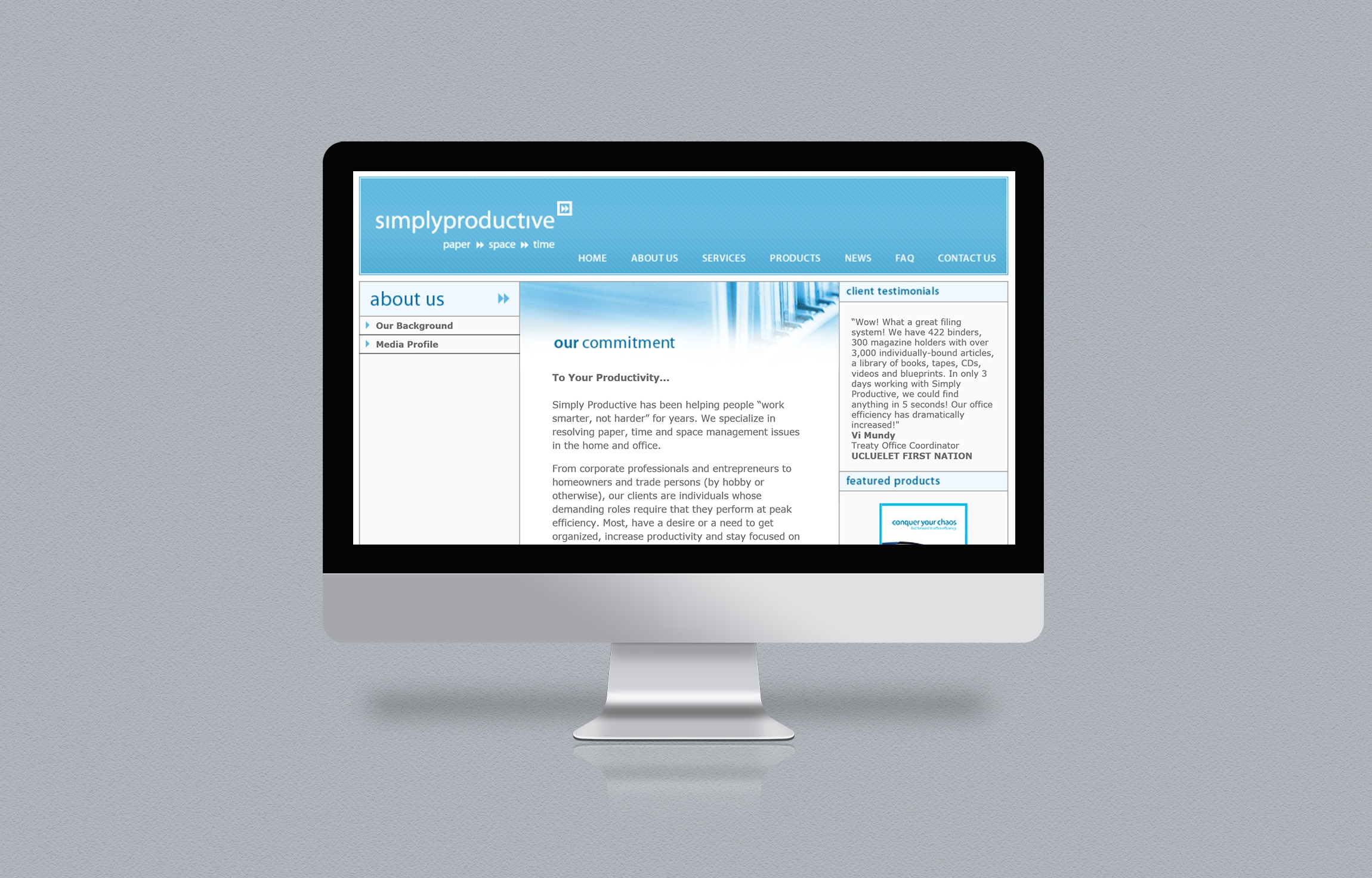
Simply Productive is a professional organizing company that works with clients to tackle clutter and disorganization of their home and work spaces to enable a more productive life and workstyle.
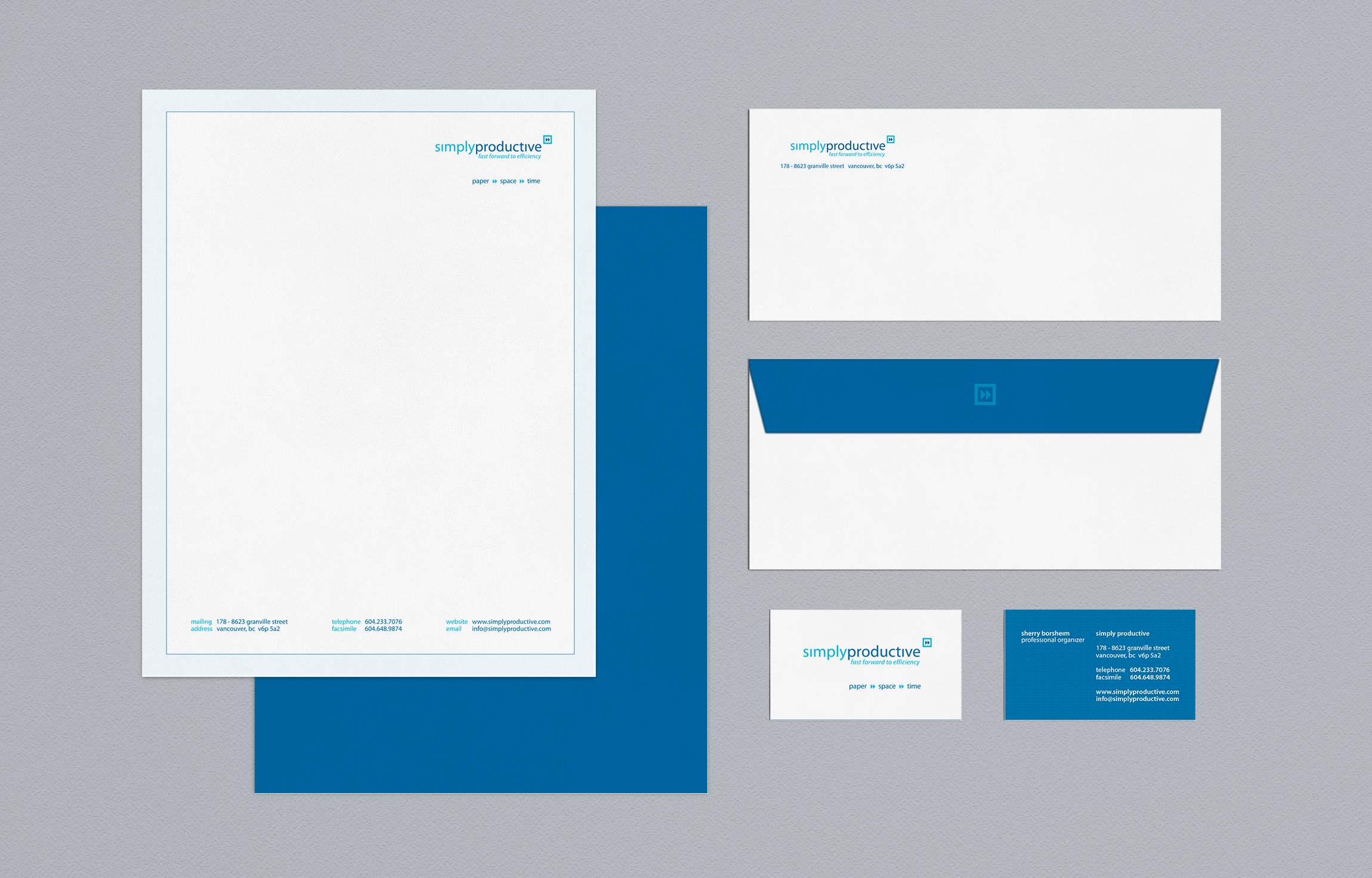
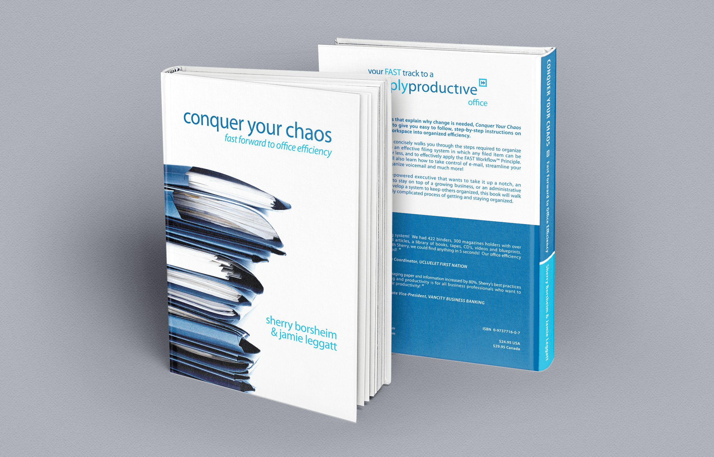
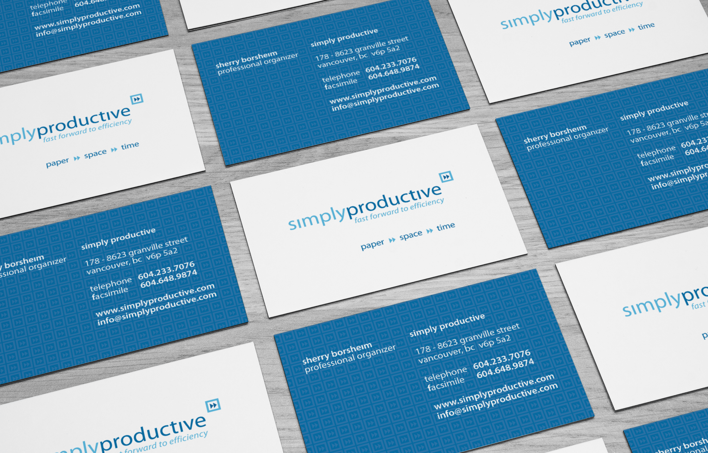
After having worked with several logo incarnations and having built a larger base of corporate clients, Ms. Borsheim felt it was time to focus on solidifying the company’s corporate identity and branding message.
At the outset of the project, BOOST’s key concern was to ensure that Simply Productive’s logo and identity pieces visually conveyed the main idea behind their service – streamlining through simplification; removing that which is not necessary to remain effective and become more efficient.
We consciously approached the project with one main goal in mind – keep the logo and identity pieces as simple as possible while preserving the effectiveness of the design.
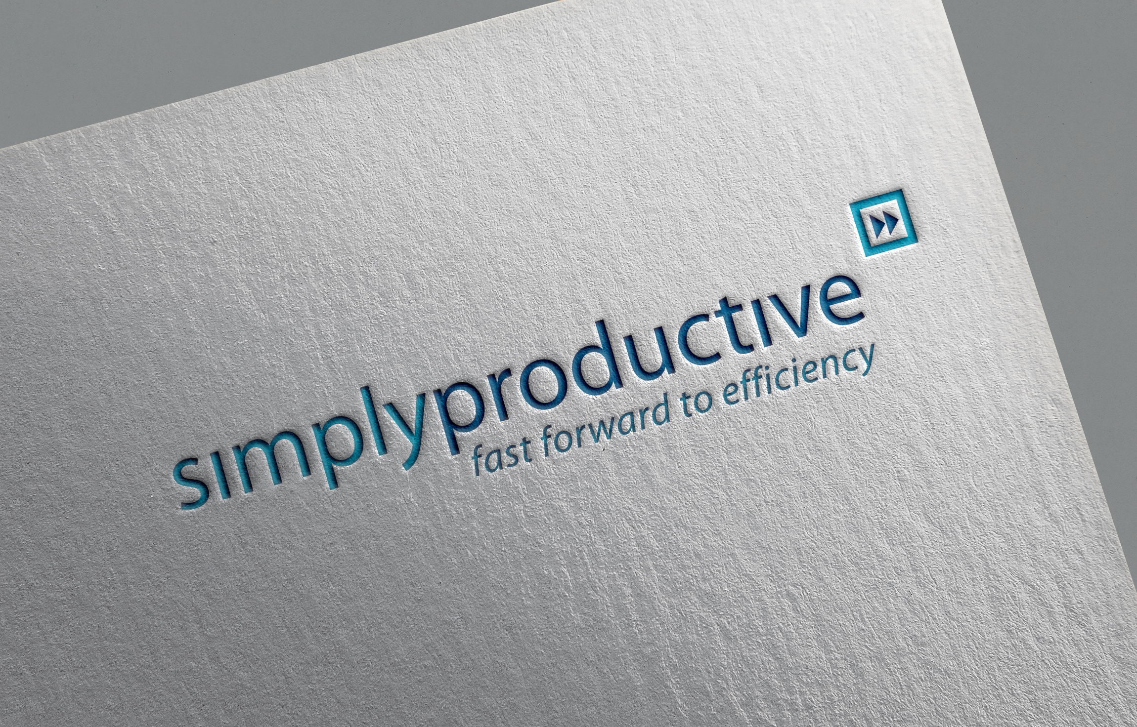
The logo consists of lowercase typography to give a less formal, more-approachable feel. We removed the dots above the letter “I” in the company name as a subtle reinforcement of what the company does – remove that which is not essential. A fast-forward style double-arrow button was used as the logomark and ties in with the slogan we coined for the client, “Fast forward to efficiency.”
Client Details
- Simply Productive
- Business Productivity
- Branding, Print, Web
- Richmond, BC
- www.simplyproductive.com
