WORK
Project Brief
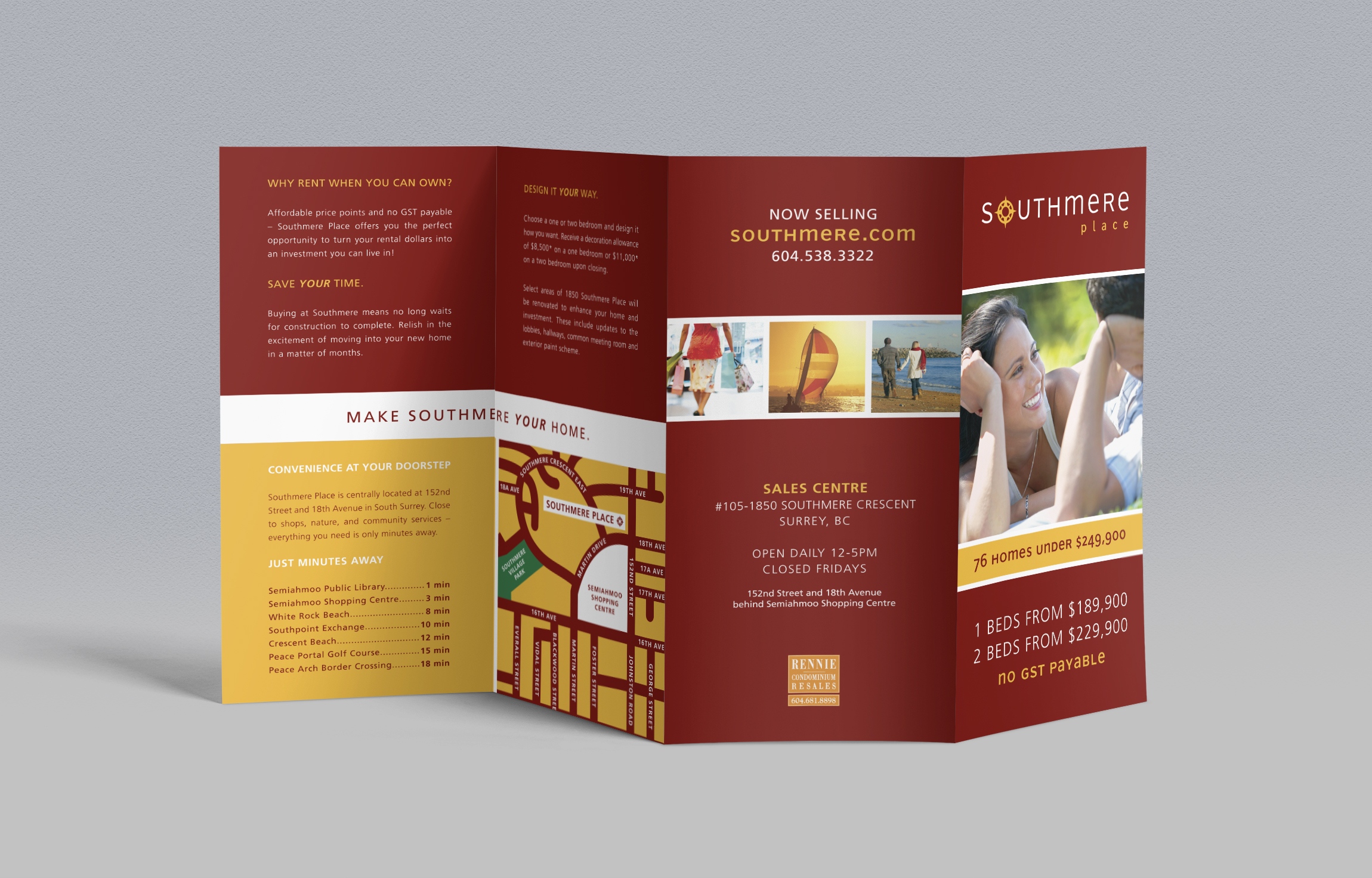
Southmere is a condominium development marketed by Rennie Marketing Systems.
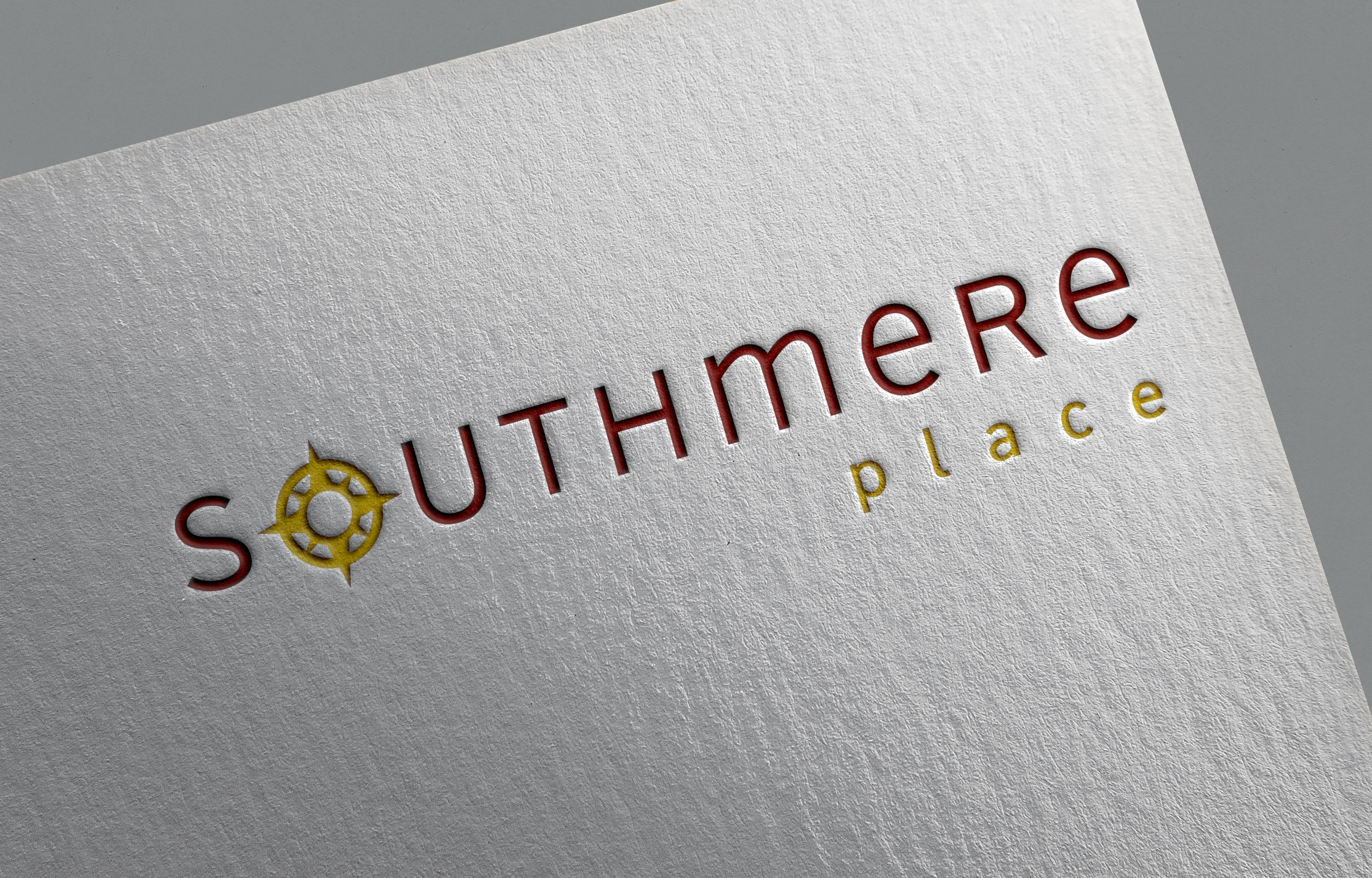
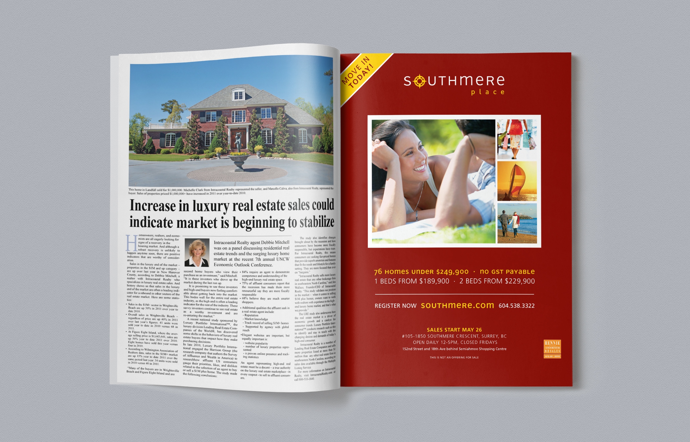
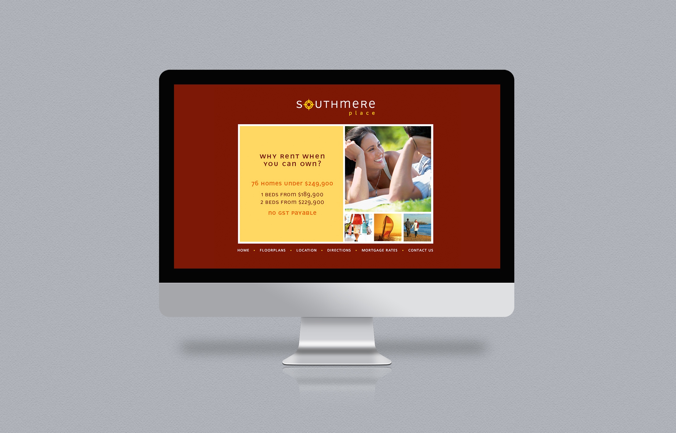
Taking inspiration from the project’s name and location – and to ensure the mark was clean and compact for a variety of applications – BOOST designed the Southmere logo using a modern typeface with a compass standing in for the O in the name.
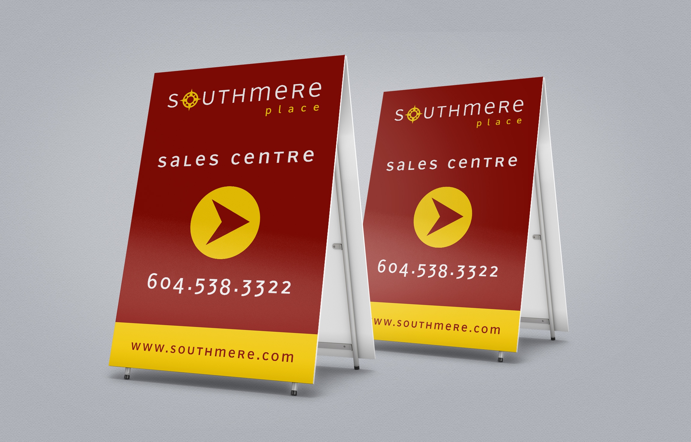
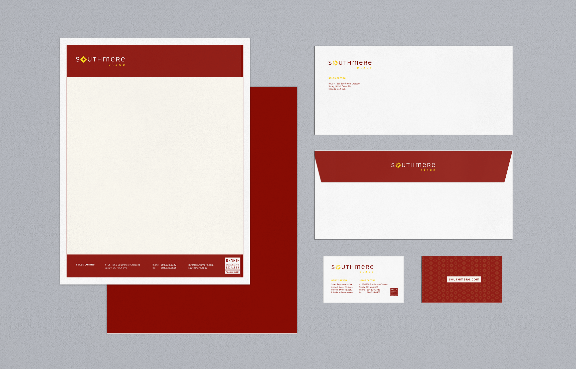
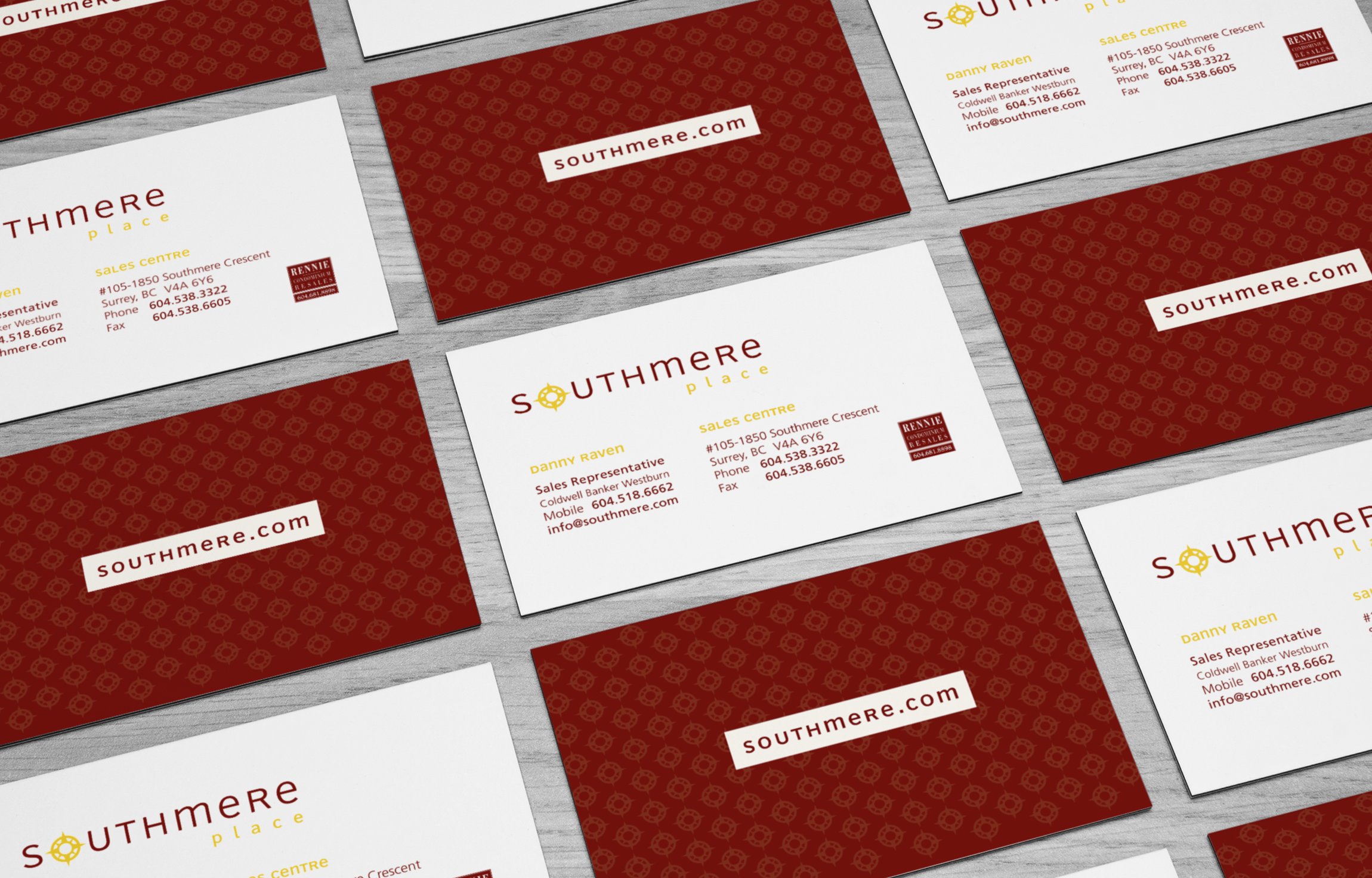
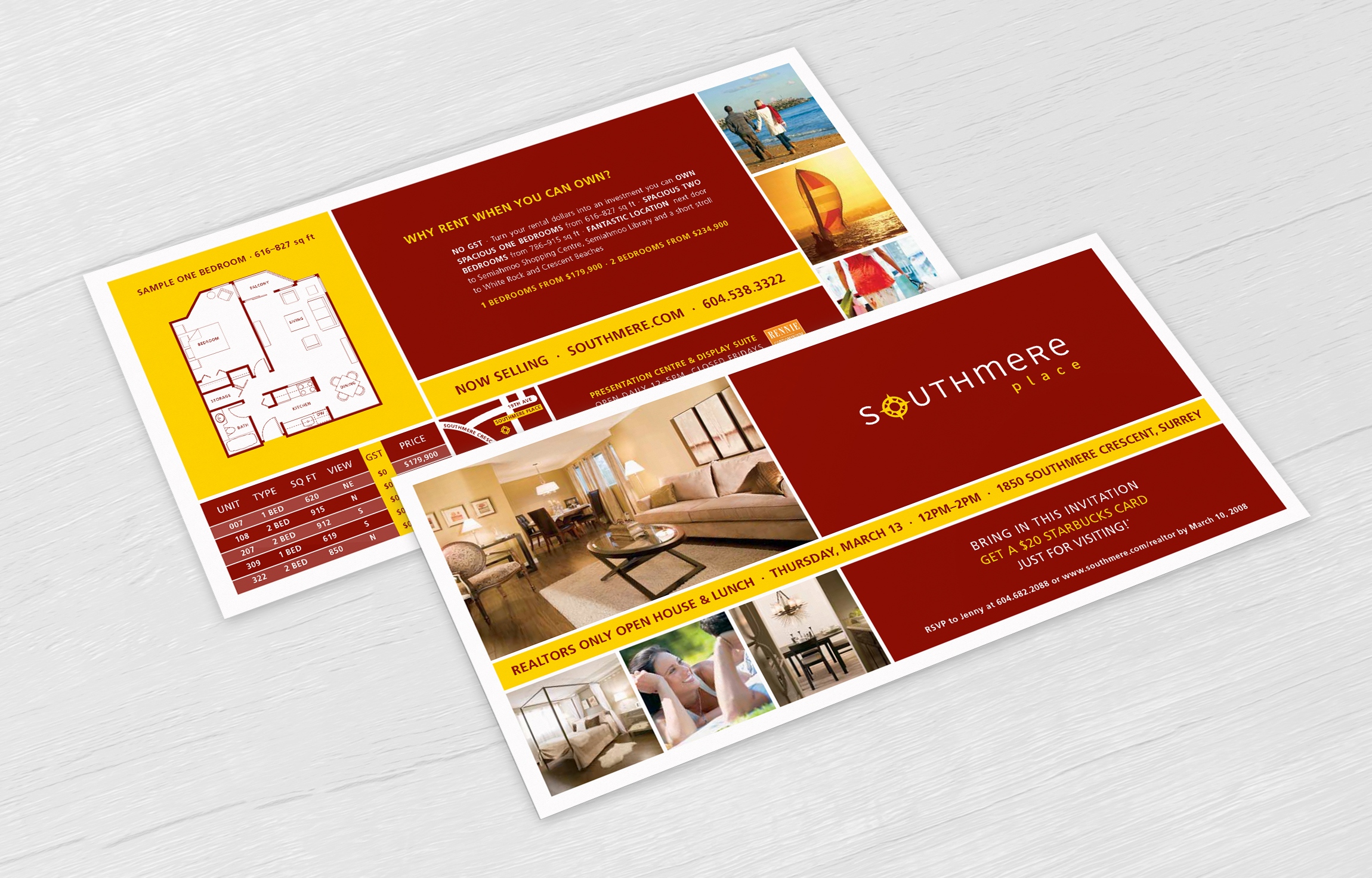
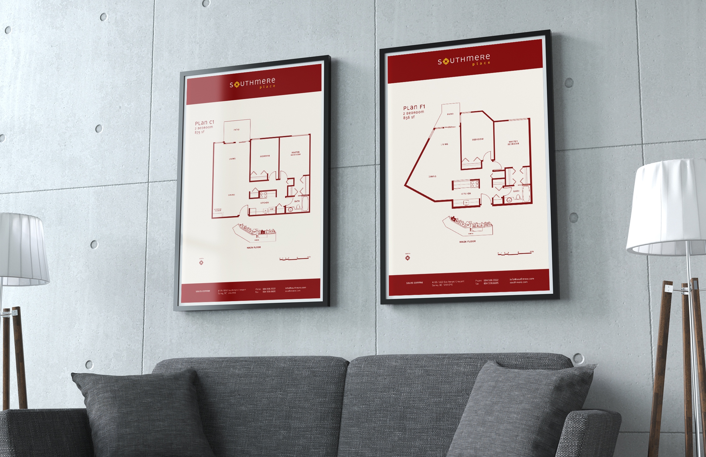
Tones of deep red and vibrant yellow were used to lend a feeling of inviting warmth to the project’s materials and to play on its famously-sunny location.
Image selection included a variety of shots offering a glimpse into the lifestyle afforded by the area’s proximity to a variety of amenities and beautiful local beaches.
Client Details
- Rennie Marketing Systems
- Real Estate Marketing
- Branding, Print, Real Estate, Web
- Vancouver, BC
- www.rennie.com
