WORK
Project Brief
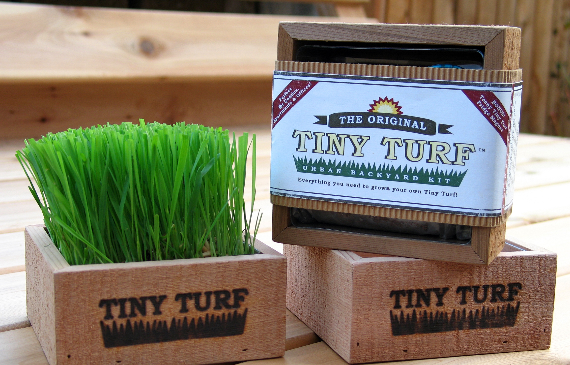
The Tiny Turf Company was inspired to create The Original Tiny Turf Urban Backyard Kit by the influence of urban downsizing on the lifestyle of metropolitan residents. The kit was designed with the idea of allowing anyone to enjoy their own backyard, regardless of the size of their space.
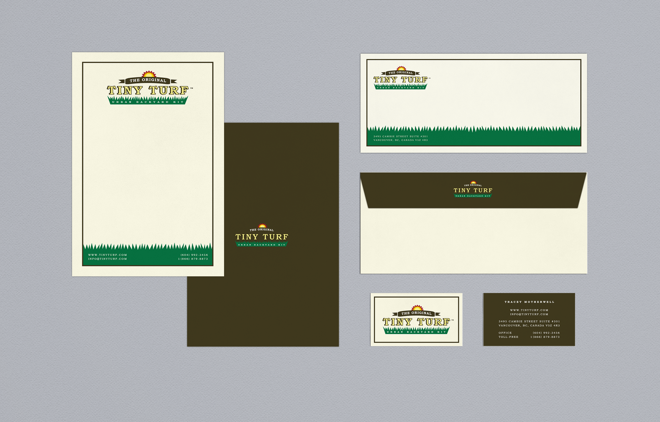
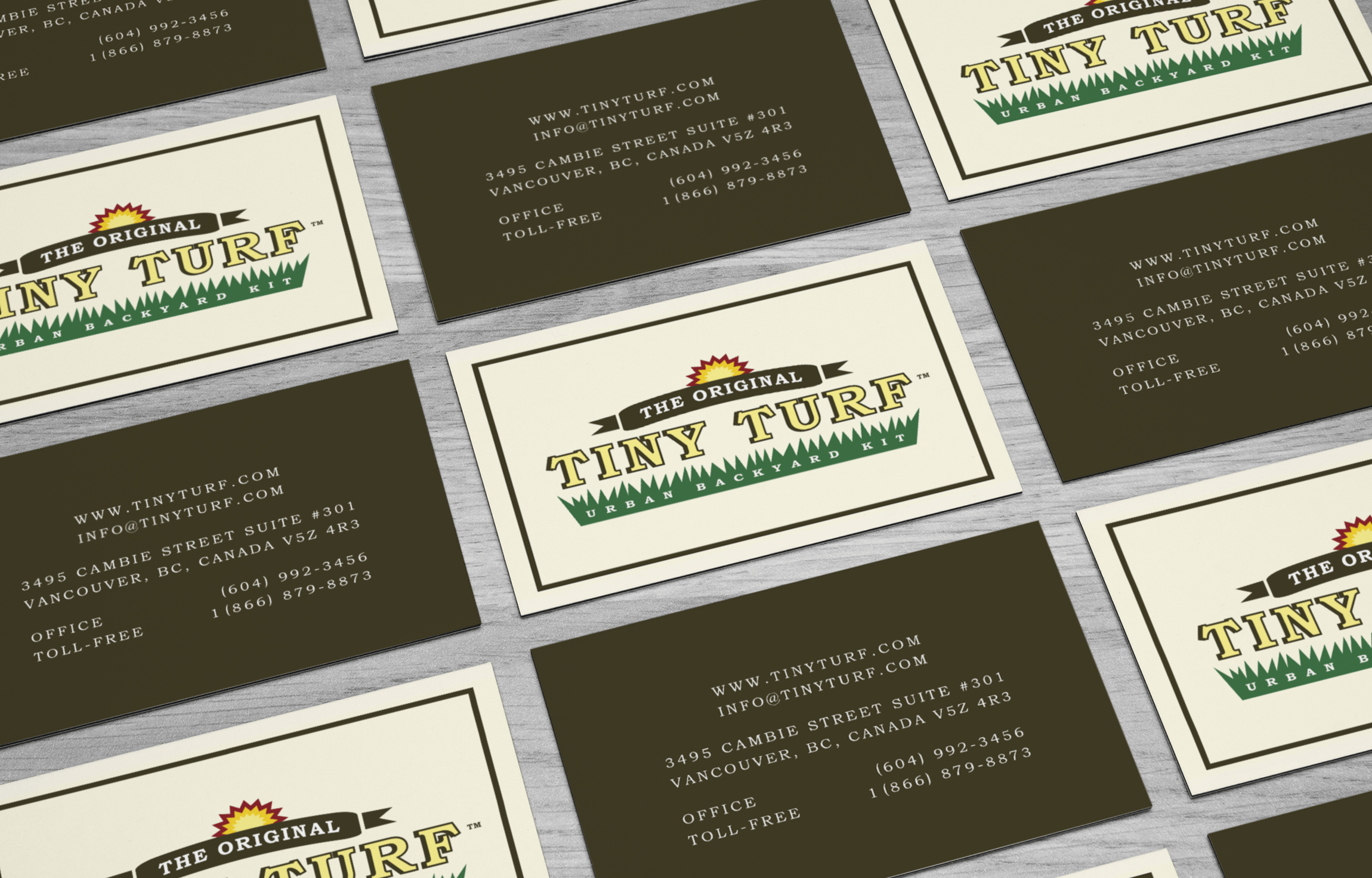
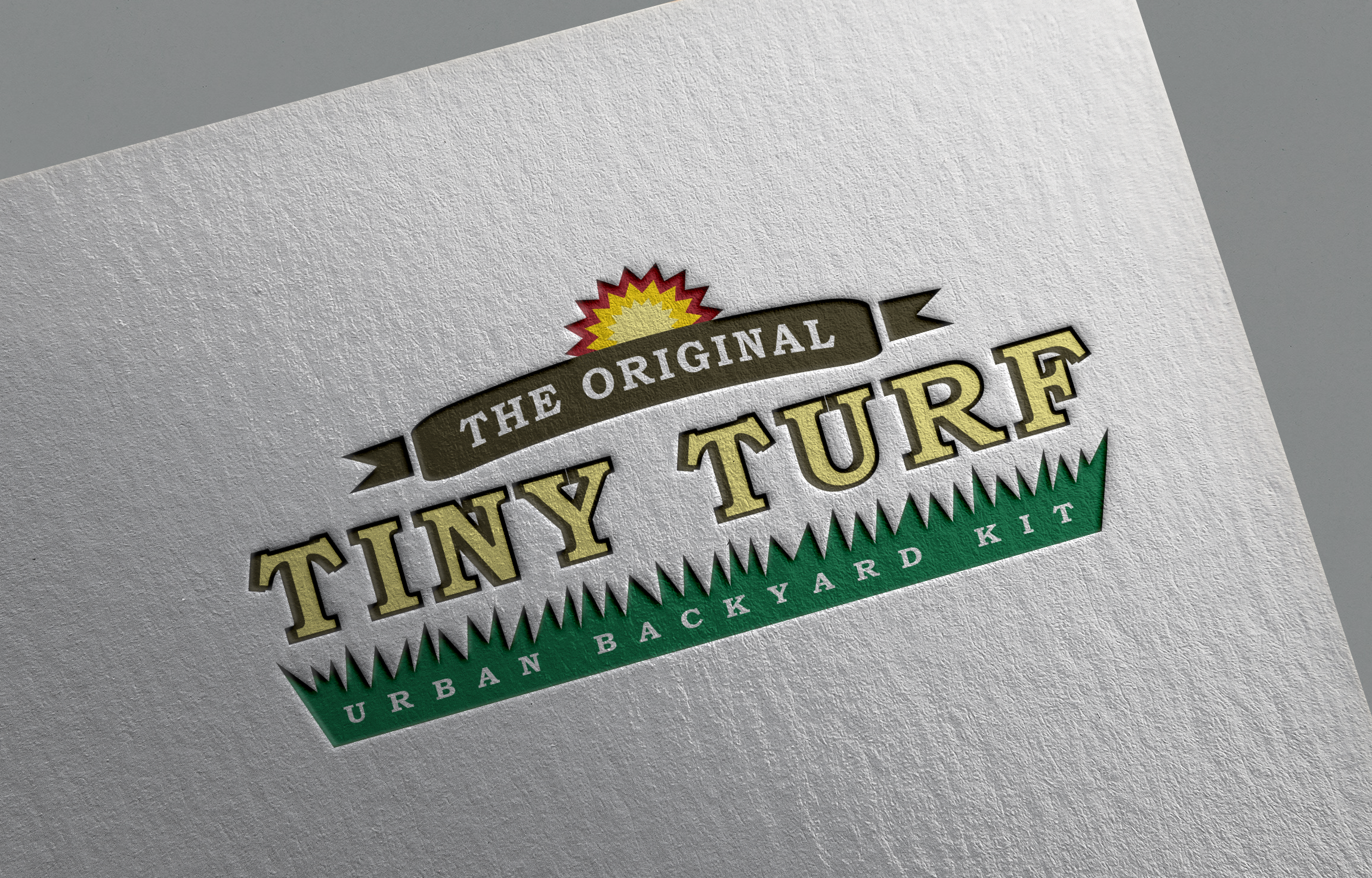
BOOST was particularly intrigued by both the concept and the catchy name of the product and set out to create an identity that would accurately portray the fun, well-crafted feel of the product. The BOOST design team drew inspiration for the logo from old-fashioned seed packets and used single-faced corrugated cardboard and brown kraft paper envelopes and boxes to convey a rustic, yet refined look.
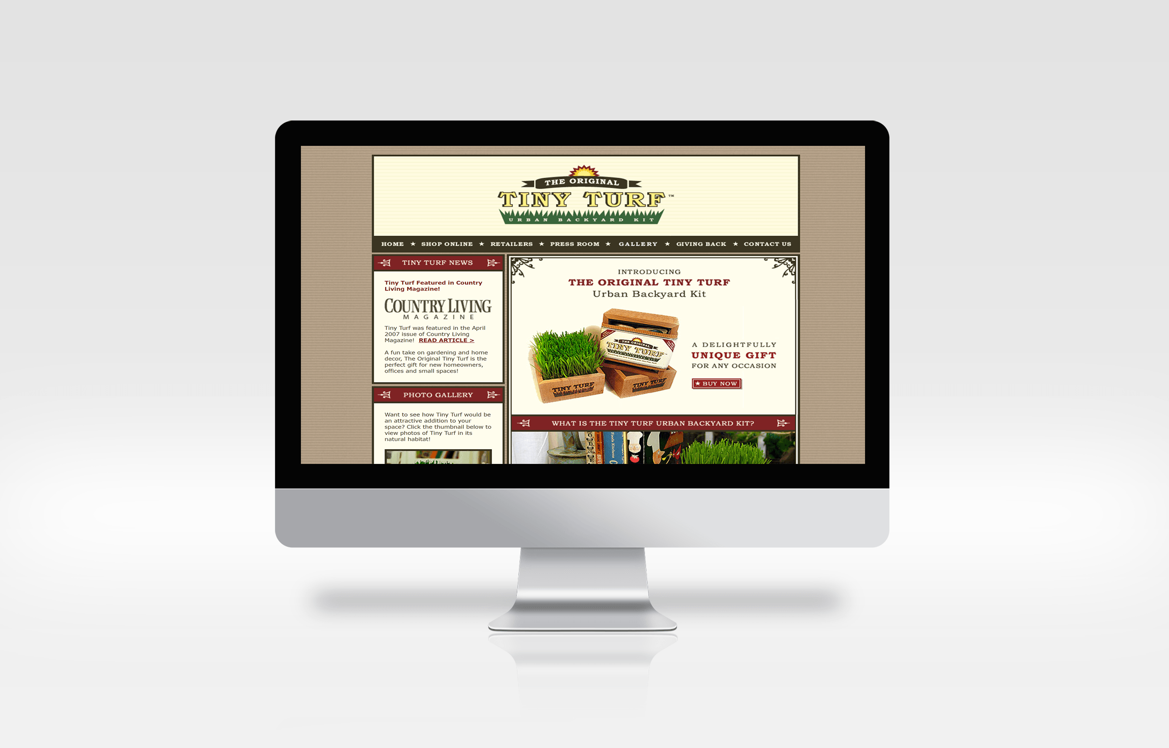
Marketing letters were printed on “tiny” letterhead and placed inside small brown envelopes to ensure a snug fit inside shipping boxes and a close integration with the small nature of the product. The grass element of the logo was used creatively throughout the campaign to tie identity collateral, packaging and web site elements together for a consistent feel.
Client Details
- Tiny Turf
- Home & Garden
- Branding, Print, Web
- Vancouver, BC
