WORK
Project Brief
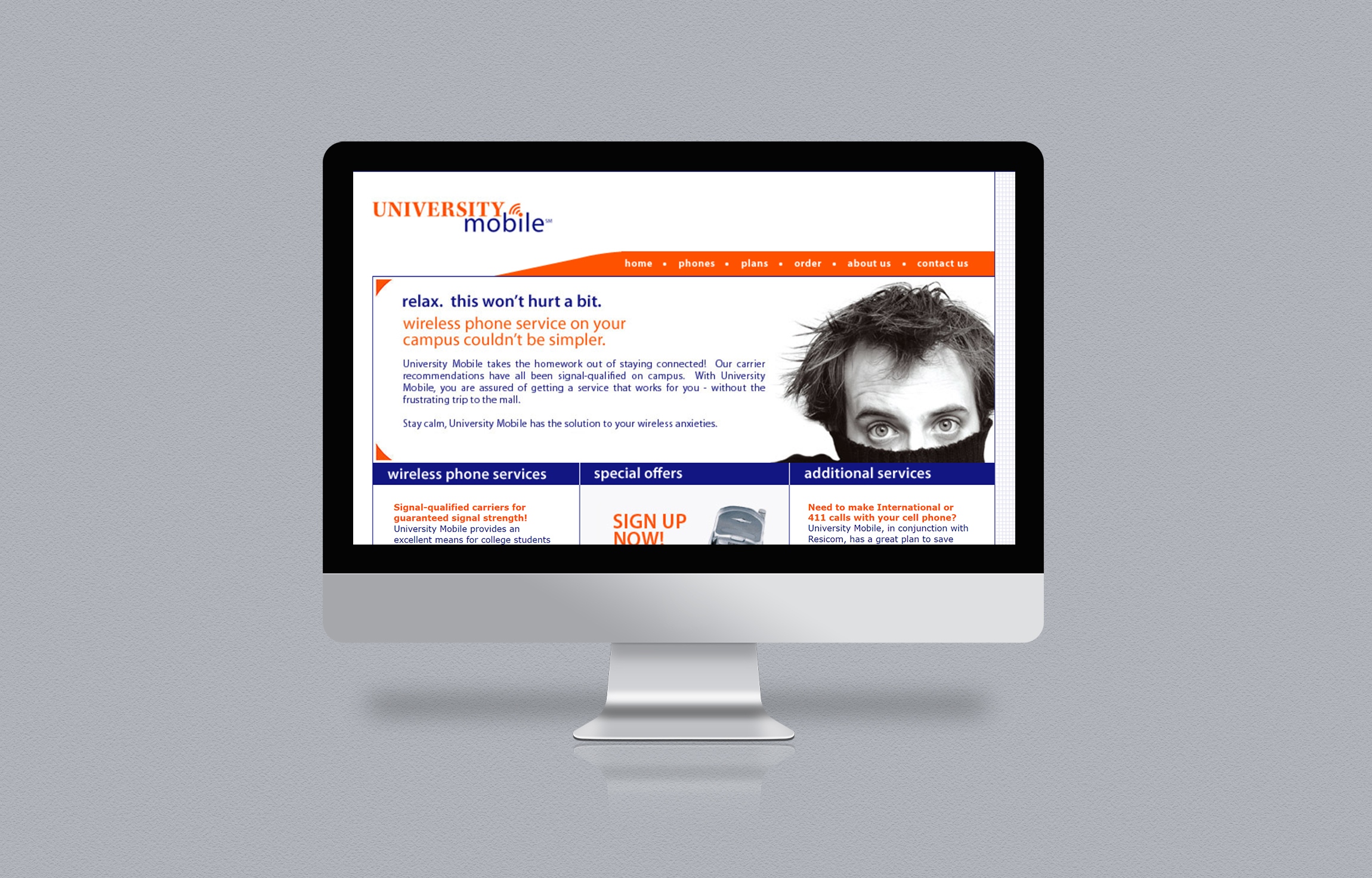
University Mobile is a company who offers mobile telephone service specifically tailored to college and university students, particularly international students. We wanted to ensure that their identity immediately connected with the target audience to communicate the essence of their service.
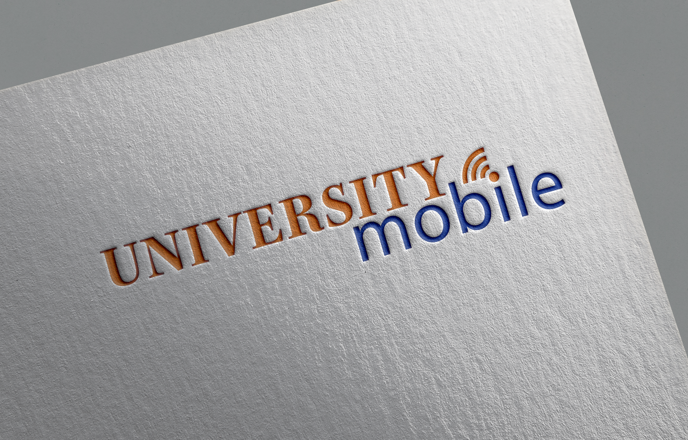
We used a bold palette of orange and blue to ensure that the logo was eye-catching and attractive to the student audience. Our choice of typefaces included a more traditional serif face for the word University and a more modern, casual face for the word Mobile. The logo employed a simple icon within the name to connect with the communications aspect of the client’s business.
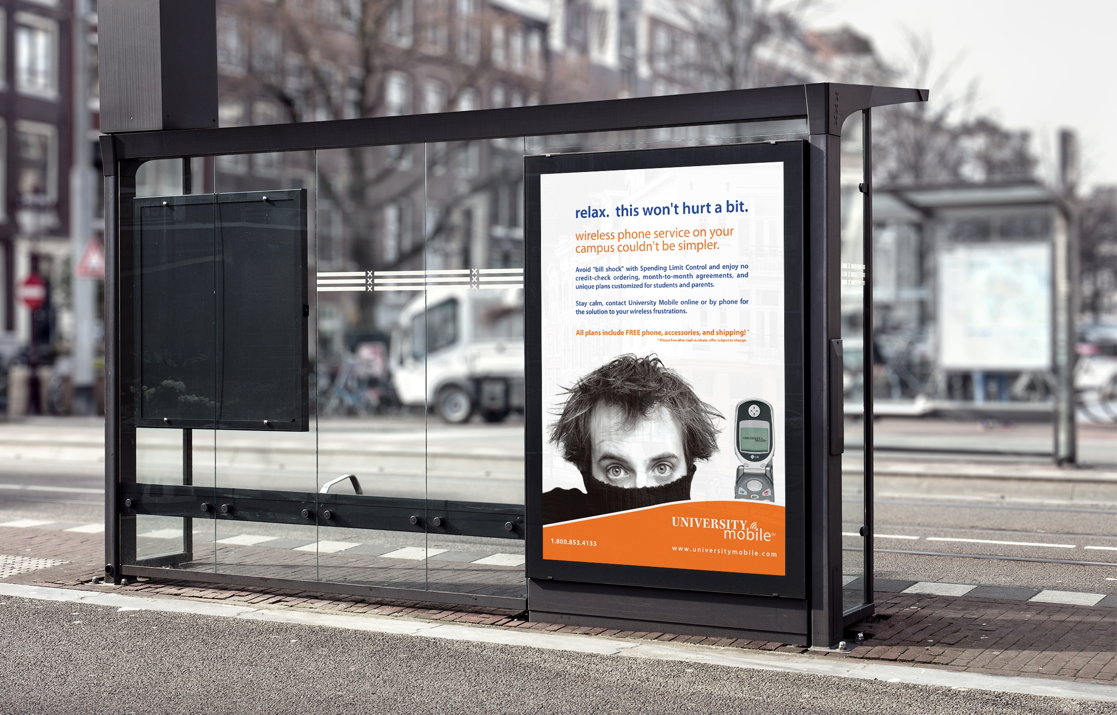
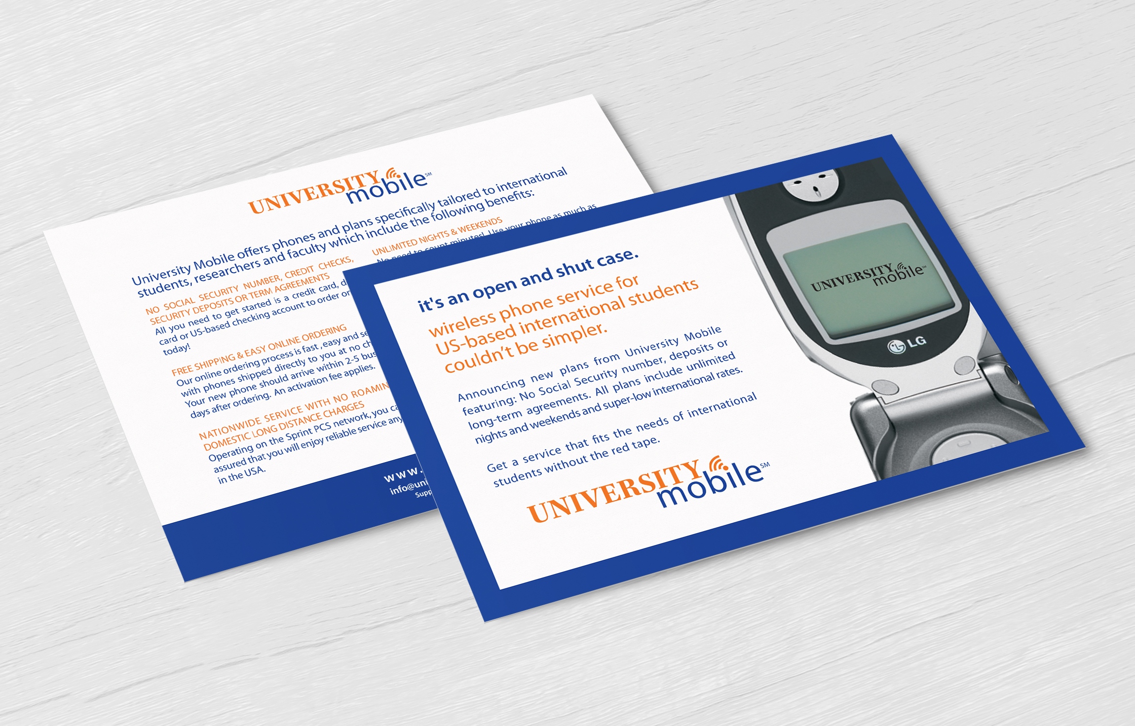
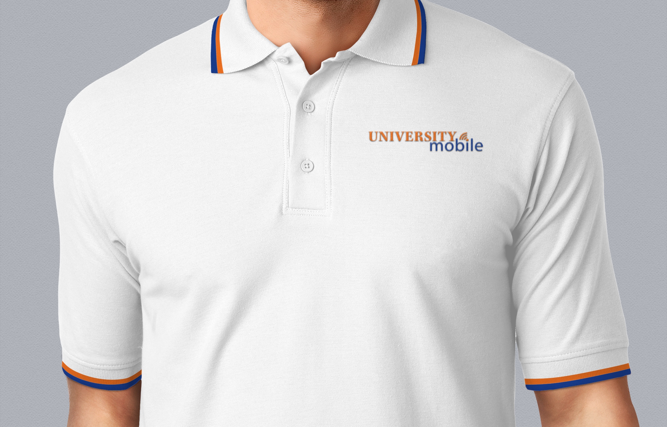
To further strengthen University Mobile’s newly-minted identity and grab the target audience’s attention, we created a series of collateral materials which incorporated eye-catching images and taglines related to their service’s features and benefits.
One of the company’s primary selling points is the “no bill shock” feature of their accounts which limits the usage of an account to help clients avoid receiving a “shocking” bill at the end of the month. The image we chose, accompanied by the tagline “Relax. This won’t hurt a bit. Wireless phone service on your campus couldn’t be simpler.” reinforced the message and captured the end user’s interest in learning more about the service.
Client Details
- University Mobile
- Telecommunications
- Logo Design, Branding, Print, Web
- Doylestown, PA
